Friday, April 23, 2010
Mental Map
Mental maps are maps that are congitively developed by each individual. Each individuals mental map will vary from person to person, for example, if two people were asked to draw a map of the same place.
Star Plots
 Star plots are tools used to examine multiple data sets for one given object and compare them to one another. This star plot compares statistics of each vehicle such as HP, MPG...etc.
http://images.google.com/imgres?imgurl=http://addictedtor.free.fr/graphiques/graphiques/graph_63.png&imgrefurl=http://addictedtor.free.fr/graphiques/graphcode.php%3Fgraph%3D63&usg=__sxidhX3R70XXFqEqLTQ345RF9ms=&h=500&w=500&sz=10&hl=en&start=10&um=1&itbs=1&tbnid=pflixI2RUZIaPM:&tbnh=130&tbnw=130&prev=/images%3Fq%3Dstar%2Bplots%26um%3D1%26hl%3Den%26gbv%3D2%26tbs%3Disch:1
Correlation Matrix
 A correlation matrix compares two different sets of data and the relationships between the two sets (correlation). Correlation matrices can determine whether two variables relate to each other very well or not at all. In this Matrix the correlation seems to be very strong between the variables.
http://images.google.com/imgres?imgurl=http://www.livestockgenomics.csiro.au/Genome_to_Phenome/matrix32_blocked.png&imgrefurl=http://www.livestockgenomics.csiro.au/Genome_to_Phenome/&usg=__Yfd_2_IeD8SayFb7gH7f48l9Nl4=&h=597&w=622&sz=82&hl=en&start=2&um=1&itbs=1&tbnid=5QQiOkveFfGYEM:&tbnh=131&tbnw=136&prev=/images%3Fq%3Dcorrelation%2Bmatrix%26um%3D1%26hl%3Den%26gbv%3D2%26tbs%3Disch:1
Similarity Matrix
 A similarity matrix is a matrix (or box) of numbers which create a table that show a similarity between two sets of data. This example is a matrix used in gene sequencing.
http://www.google.com/imgres?imgurl=http://politicalmaps.org/wp-content/uploads/2008/05/electoral-map-prediction-05222008.gif&imgrefurl=http://meganblomberg.blogspot.com/2009_04_01_archive.html&usg=__k1YAIfvcyY7bUWgXPiwluaSn4Q0=&h=474&w=742&sz=32&hl=en&start=158&itbs=1&tbnid=uetzXqw3j6roKM:&tbnh=90&tbnw=141&prev=/images%3Fq%3Dplanimetric%2Bmap%26start%3D147%26hl%3Den%26sa%3DN%26gbv%3D2%26ndsp%3D21%26tbs%3Disch:1
Stem and Leaf Plot

A stem and leaf plot is a way of organizing numerical data to show its distribution. The plot shown here represents the per capita GNP of Western Africa.
Box Plot

A box plot (or box and whiskers diagram) is a way of representing data through what is known as the 5 number summary. This includes the lowest value, lower quartile Q1, middle Q2, upper quartile Q3, and highest value as shown in this example. This example has no numerical data, but most box plots combine this with numerical data to specify where that data falls into the 5 number summary.
Histogram

A histogram is simply a graphical display of tabulated frequencies. This histogram shows the average salary for a company based on its employee population.
Parallel Coordinate Graph

Parallel coordinate graphs are used to compare large amounts of multivariate data. Each set of data uses the same x and y coordinates. This is a fairly small parallel coordinate graph of the amount of glucose, fructose, maltose, and saccharose in various vegetables and fruits, however, some parallel coordinate graphs can include hundreds of sets of data.
Triangular Plot
 A triangular plot uses three variables compared to one another. This map uses three different areas of the Aelutian islands to compare the Hmax off Kaui for various slip allocations.
http://images.google.com/imgres?imgurl=http://www.pmel.noaa.gov/maillists/tmap/ferret_users/fu_2007/jpgCqrZqdDwYG.jpg&imgrefurl=http://www.pmel.noaa.gov/maillists/tmap/ferret_users/fu_2007/msg00384.html&usg=__BbOkUttPv0jmFyojw9chRDfwJaU=&h=464&w=463&sz=135&hl=en&start=2&um=1&itbs=1&tbnid=lX7Ktsi11XtDBM:&tbnh=128&tbnw=128&prev=/images%3Fq%3Dtriangular%2Bplot%26um%3D1%26hl%3Den%26sa%3DN%26gbv%3D2%26ndsp%3D21%26tbs%3Disch:1
Wind Rose
 A wind rose is a tool used to determine the distribution of wind speed and direction for a given location. They are always in circular form and depict every direction. This wind rose example does not say what location the data is from, but one can easily assume that wind was coming from the southeast a majority of the month at a wide variety of speeds.
http://images.google.com/imgres?imgurl=http://www.nws.noaa.gov/mdl/pgb/AvnFPS/3.2/html/images/cli-new4.png&imgrefurl=http://www.nws.noaa.gov/mdl/pgb/AvnFPS/3.2/html/climate-new.html&usg=__nnlpXgQqBxWubOR5dhuS04KZHX4=&h=574&w=532&sz=188&hl=en&start=18&um=1&itbs=1&tbnid=FG2VO8Ng48yg-M:&tbnh=134&tbnw=124&prev=/images%3Fq%3Dwind%2Brose%26um%3D1%26hl%3Den%26gbv%3D2%26tbs%3Disch:1
Climograph

Climographs represent the monthly levels of precipitation and temperature of a location. Anyone who has pulled up a long term weather forecast on the internet has probably seen a climograph. This climograph charts out the precipitation and temperature averages for each months for the city of Honolulu, Hawaii.
Population Profile
 Population Profiles are often portrayed in a pyramid-like form representing population statistics over a given time. This map is of Saxony, and it represents a very backwards trend, with a small infant population and a lare adult population, which could imply lack of reproduction or high infancy death rates. For developed countries, there is usually a much more defined pyramid-like shape to the population profile.
http://images.google.com/imgres?imgurl=http://www.sachsen.de/en/img/413_bevstruktur.jpg&imgrefurl=http://www.sachsen.de/en/225.htm&usg=__mWjhVsmM9xGi_RccqPT34NiI-7I=&h=618&w=413&sz=75&hl=en&start=18&um=1&itbs=1&tbnid=7-38nujySWuz6M:&tbnh=136&tbnw=91&prev=/images%3Fq%3Dpopulation%2Bprofile%26um%3D1%26hl%3Den%26gbv%3D2%26tbs%3Disch:1
Scatter Plot
 A scatter plot is used to plot the data of two variables in order to determine a pattern, or lack thereof. This scatter plot doesnt represent any particular variable, but illustrates the kind of result a scatter plot may produce, showing an obvious increasing trend.
http://images.google.com/imgres?imgurl=http://www.netmba.com/images/statistics/plot/scatter/scatterplot.gif&imgrefurl=http://www.netmba.com/statistics/plot/scatter/&usg=__KjtT1wjlB4P5vu-XZGQ5FdqYGlM=&h=217&w=268&sz=4&hl=en&start=2&um=1&itbs=1&tbnid=Mu2181B_9_0hnM:&tbnh=91&tbnw=113&prev=/images%3Fq%3Dscatter%2Bplot%26um%3D1%26hl%3Den%26gbv%3D2%26tbs%3Disch:1
Index Value Plot
 An index value plot is a graph that plots the data of a variable within a range rather than plotting specific points. This map shows the average streamflow index between March and April 2010. http://images.google.com/imgres?imgurl=http://waterwatch.usgs.gov/regplots/real/real_us_2.gif&imgrefurl=http://waterwatch.usgs.gov/%3Fm%3Dreal%26w%3Dplot&usg=__SkLsaX_xX2VHXAW_RzHpPuLd5-8=&h=450&w=550&sz=7&hl=en&start=12&um=1&itbs=1&tbnid=W4WSMU1TKFatsM:&tbnh=109&tbnw=133&prev=/images%3Fq%3Dindex%2Bvalue%2Bplot%26um%3D1%26hl%3Den%26gbv%3D2%26tbs%3Disch:1
Lorenz Curve
 A Lorenz Curve (or accumulative line graph as it is also known) compares the distribution of two variables against each other to determine whether distribution is equal or unequal. Unequal distributions will always result in two lines, whereas equal distribution would result in one solid 45 degree line. This Lorenz curve compares the cumulative percent of income with the cumulative percent of population.
 http://images.google.com/imgres?imgurl=http://content.answers.com/main/content/img/oxford/Oxford_Geography/0198606737.lorenz-curve.1.jpg&imgrefurl=http://www.answers.com/topic/lorenz-curve&usg=__kCju4PszStY8ppn7wcrjpTzHFwk=&h=436&w=431&sz=27&hl=en&start=1&um=1&itbs=1&tbnid=hwE39wO2MLKC8M:&tbnh=126&tbnw=125&prev=/images%3Fq%3Dlorenz%2Bcurve%26um%3D1%26hl%3Den%26gbv%3D2%26tbs%3Disch:1
Bilateral Graph
 Bilateral graphs are graphs that compare two sets of data to one another using the same x and y planes. This bilateral graph shows the trade-weighted index of the Australian dollar between the TWI and ATWI weights.
http://images.google.com/imgres?imgurl=http://www.rba.gov.au/publications/bulletin/2008/feb/images/aug-twi-aus-dol-graph4.gif&imgrefurl=http://www.rba.gov.au/publications/bulletin/2008/feb/1.html&usg=___NpUIrFEE4qKGqTg3viUuDyVAGs=&h=526&w=665&sz=41&hl=en&start=15&um=1&itbs=1&tbnid=4dQ05sBtGjkOZM:&tbnh=109&tbnw=138&prev=/images%3Fq%3Dbilateral%2Bgraph%26um%3D1%26hl%3Den%26sa%3DN%26gbv%3D2%26tbs%3Disch:1
Nominal Area Choropleth Maps

Nominal area choropleth maps use nominal data to show measurable differences in a variable from area to area. This map represents the percentage of black condo owners in California. The map is planimetric, thematic, statistical, classed, univariate, and a type of choropleth map.
Univariate Map

A univariate choropleth map, unlike a bivariate choropleth map, shows only one set of data rather than two. This map shows the population per square mile by state. It is planimetric, thematic, classed, statistical, and a type of choropleth map.
Bivariate Choropleth Maps

Bivariate choropleth maps use two different sets of data combined into one map using colors and symbols. These maps can be classes or unclassed, and the two sets of information are usually purposely paired together to go hand in hand. This map shows the crime rates in 2003 vs the election results in 2004 between Bush and Kerry. This map is planimetric, thematic, statistical, classed, and a type of choropleth map.
Unclassed Choropleth Maps
Unclassed choropleth maps assign shadings that are proportional to the data, requiring no classification of the data. This gives each value a unique shading of color. This map shows the 2004 presidential votes to each state's electoral votes. This map is planimetric,thematic, statistical, and a type of choropleth map.
Classed Chloropleth Maps
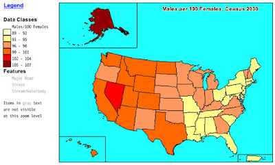
 Classed Chloropleth Maps use color coding to label data. Due to the amount of labeling the creator has to determine (colors, shades, ranges) these maps will often look very different from one another depending on the creator. This map shows the ratio of males to females according to the 2000 census. The map can also be classified as planimetric, statistical, and a type of chloropleth map.
http://images.google.com/imgres?imgurl=http://my.ilstu.edu/~jrcarter/Geo204/Choro/map-AmFact-4eqint-orange-80pct.jpg&imgrefurl=http://my.ilstu.edu/~jrcarter/Geo204/Choro/&usg=__1MczQmkAU7yjjJPpn1hFoGK0Lq0=&h=312&w=520&sz=57&hl=en&start=5&um=1&itbs=1&tbnid=24j8JVFARwIw7M:&tbnh=79&tbnw=131&prev=/images%3Fq%3Dclassed%2Bchoropleth%26um%3D1%26hl%3Den%26sa%3DN%26gbv%3D2%26ndsp%3D21%26tbs%3Disch:1
Range Graded Proportional Circle

Range graded proportional cirlces, unlike other proportional circles maps, rely on a predetermined value for a circle's size range located in the table on the map rather than size being determined by proportion to other areas. This map compares the Filipino population of a portion of the U.S. This map is planimetric, statistical, and a type of proportional circles map.
Continuously Variable Proportional Circles
 Continuously Variable Proportional Circles Maps are a type of proportional circles map that use circles to create point data. This map, for instance, not only shows the size of each locations industry size in relationship to other locations, but breaks down each area's industries into their exact industry percentages. This could be one way to determine the economic success or failure of an area, though not the only factor involved in most cases. This map is also planimetric, statistical, and a type of dot distribution map.
http://images.google.com/imgres?imgurl=http://www.isgs.uiuc.edu/nsdihome/webdocs/doqs/images/charleston_q30.jpg&imgrefurl=http://www.isgs.uiuc.edu/nsdihome/webdocs/doqs/info.html&usg=__3exLHXE9KCPM-Pxr8D73SaH2WDw=&h=380&w=642&sz=144&hl=en&start=5&um=1&itbs=1&tbnid=1yUx6rHBhlrQVM:&tbnh=81&tbnw=137&prev=/images%3Fq%3Ddigital%2Borthoimagery%2Bquarter%2Bquadrangles%26um%3D1%26hl%3Den%26sa%3DN%26gbv%3D2%26tbs%3Disch:1
DOQQ Maps
Digital Orthoimagery Quarter Quadrangles are aerial photographs in which distortion caused by normal aerial photographs such as relief displacement and camera angle are removed using computer technology. This allows the image to be used as a reliable map for calculating distances, angles...etc. The map shown is a DOQQ of Cole County, Il. Though digitally altered, this map could still be partially considered a black and white aerial photo and a hypsometric map.http://images.google.com/imgres?imgurl=http://www.isgs.uiuc.edu/nsdihome/webdocs/doqs/images/charleston_q30.jpg&imgrefurl=http://www.isgs.uiuc.edu/nsdihome/webdocs/doqs/info.html&usg=__3exLHXE9KCPM-Pxr8D73SaH2WDw=&h=380&w=642&sz=144&hl=en&start=5&um=1&itbs=1&tbnid=1yUx6rHBhlrQVM:&tbnh=81&tbnw=137&prev=/images%3Fq%3Ddigital%2Borthoimagery%2Bquarter%2Bquadrangles%26um%3D1%26hl%3Den%26sa%3DN%26gbv%3D2%26tbs%3Disch:1
DEM Maps

Digital Elevation Models (DEM) are digitally constructed maps of ground topography. Though created through use of computers, the information needed relies on other forms of information such as aerial photography and LIDAR. There is no particular area that this map represents, but is a good example of how a digital elevation model looks. This map is also hypsometric and chloropleth, and possibly an exact replica of a LIDAR image.
DRG Maps
 Digital Raster Graphs (DRG) maps are scanned images from USGS topographic maps. The map shown here is a DRG map of Bushkill, PA. The contour lines represent topographic information, and I assume the green shading represents vegetation while the white shading represents sand, or a lack of vegetation. This map is also topographic and an isoline map.
http://www.google.com/imgres?imgurl=https://www.e-education.psu.edu/files/geog482/image/drg_bushkill_sw.gif&imgrefurl=https://www.e-education.psu.edu/natureofgeoinfo/c6_p6.html&usg=__CJVhpkuO84UI7kbKi4knaZNZJZE=&h=370&w=519&sz=30&hl=en&start=4&itbs=1&tbnid=mZF37nXDl4YNOM:&tbnh=93&tbnw=131&prev=/images%3Fq%3Ddigital%2Braster%2Bgraph%26hl%3Den%26gbv%3D2%26tbs%3Disch:1
Isopleths
 Isopleths are lines that represent a constant value of a given variable on a map. Unlike other isoline maps (with the exception of isopachs which do not fluctuate as often) isopleths are normally much more constant in their readings. This map shows hydrogen ion concentration as pH (acid rain) in the U.S. in 1998. The map shown is also planimetric, chloropleth, thematic, and an isoline map.
Isopachs

Isopachs are lines that connect areas of equal THICKNESS. These maps normally represent some kind of strata. The map shown represents the rock thickness off the Wessex Coast of England. This map is also planimetric, thematic, and an isoline map.
Isohyets
 Isohyets are lines that connect equal areas of RAINFALL on a map. This map shows the rainfall levels on the continent of Africa using isohyets. Notice the lack of rainfall in the north due to the dry desert climate. This map is also planimetric, chloropleth, thematic, and an isoline map.
http://images.google.com/imgres?imgurl=http://www.artsci.wustl.edu/~anthro/courses/306/precip.GIF&imgrefurl=http://artsci.wustl.edu/~anthro/courses/306/geography.html&usg=__a1VebgNSEhskKHyPYyzATaLRDnY=&h=566&w=475&sz=43&hl=en&start=10&um=1&itbs=1&tbnid=u4HZDdDqIWGSBM:&tbnh=134&tbnw=112&prev=/images%3Fq%3Disohyets%26um%3D1%26hl%3Den%26gbv%3D2%26tbs%3Disch:1
Isotachs

Isotachs, similar to isobars, are also lines connecting points of equal properties. However, isotachs connect areas with similar WIND SPEEDS. This map shows the wind speeds in a large portion of the U.S. using isotachs. This map is also planimetric and an isoline map.
http://images.google.com/imgres?imgurl=http://www.crh.noaa.gov/lmk/soo/research/papfigs/11794pap_fig3.gif&imgrefurl=http://www.crh.noaa.gov/lmk/soo/research/paps_11794.php&usg=__D--dJEn5Hcf5q81AkBsPoUI28Tk=&h=264&w=270&sz=25&hl=en&start=7&um=1&itbs=1&tbnid=VWchT_Rj9Id1zM:&tbnh=110&tbnw=113&prev=/images%3Fq%3Disotachs%26um%3D1%26hl%3Den%26sa%3DN%26gbv%3D2%26ndsp%3D21%26tbs%3Disch:1
Isobars

Isobars are lines that connect areas of equal atmospheric pressure. This map represents the atmospheric pressures of Europe and North Africa. This map is also planimetric and an isoline map.
LIDAR

Light Detection and Ranging (LIDAR) is a remote sensing technology that uses laser pulses to determine topographic information such as distance, depth...etc. The map above shows a large hole in a reef taken by LIDAR equipment. Temperature of the seafloor (or water) is represented by color, with red being the warmest. This map is also hypsometric and chloropleth.
Doppler Radar

Doppler Radar utilizes the doppler effect to produce images of storms by beaming microwaves towards them and calculating the amount of reflection that it receives back. Doppler radar readings are very accurate and are very common to most people. This doppler image shows the landfall of Hurricane Katrina in 2005. This map is also planimetric and chloropleth.
Black and White Aerial Photo
 Black and white aerial photos are mostly used for reference or personal purposes. They are not able to pick up heat signals like their infrared counterparts, and therefore are not as effective in monitoring the environment, other than structural changes over time perhaps. This map shows an aerial photograph of a large city and is also hypsometric.
http://www.google.com/imgres?imgurl=http://www.fas.org/irp/imint/docs/rst/Sect21/BloomAerial4.JPG&imgrefurl=http://www.fas.org/irp/imint/docs/rst/Sect21/examq21.html&h=427&w=400&sz=110&tbnid=SIC6CvJnBukHBM:&tbnh=232&tbnw=218&prev=/images%3Fq%3Dblack%2Band%2Bwhite%2Baerial%2Bphoto&hl=en&usg=__PWsXBH096fxMB75a5Gr1rQ9xRbU=&ei=gjfSS6yJOojc9ATSvdGrDw&sa=X&oi=image_result&resnum=3&ct=image&ved=0CAoQ9QEwAg
Infrared Aerial Photography
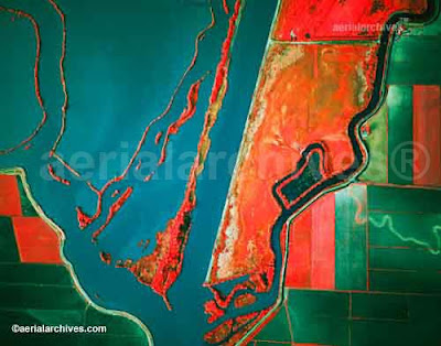 Infrared aerial photography use infrared film and digital sensors, which are sensitive to a certain portion of the light spectrum. Infrared aerial photography is important for monitoring structures or objects that give off unique heat signatures. This map shows vegetation, and one can easily notice the farms to the right, whose different crops give off different heat signatures. This map is also hypsometric. This map could also serve as a thematic map if a proper key could be established linking color to vegetation type.
Cartographic Animations
 (click to see animation)
Cartographic animations show changes over time. This map shows the path of the tsunami that devestated Indonesia back in 2004. This map is too small for me to determine if there is raised relief, however there seem to be colors on land that indicate relief (although no key is available), and even the tsunami waves are color coded, which I assume refer to the height of the wave as well. Therefore, I would have to classify this map as hypsometric and chloropleth.
http://en.wikipedia.org/wiki/File:2004_Indonesia_Tsunami_100px.gif
Statistical Maps
 Statistical maps contain data that are variable from area to area and can be measured from some kind of key. These maps can utilize color, dots (such as a dot distribution map), bars, isolines..etc. This map shows the change in unemployment rates from March, 2009-February, 2010. This map is also planimetric, thematic, and chloropleth.
http://images.google.com/imgres?imgurl=http://www.bls.gov/lau/maps/twmcort.gif&imgrefurl=http://www.freerepublic.com/focus/f-news/2332793/posts&usg=__l4nko4NwSo_6qlvlA2R6nshS9lU=&h=719&w=959&sz=48&hl=en&start=133&um=1&itbs=1&tbnid=jqEAvM0NXL0erM:&tbnh=111&tbnw=148&prev=/images%3Fq%3Dstatistical%2Bmaps%26start%3D126%26um%3D1%26hl%3Den%26sa%3DN%26gbv%3D2%26ndsp%3D18%26tbs%3Disch:1
Cartograms
 Cartograms are maps that portray land size according to data, causing the map to look distorted compared to its actual dimensions. This map, for example, represents the 2008 election and redistributes the dimensions of each state based upon their population. Looking at a standard thematic map, it almost looks as if there are more red states than blue states, but compared to this cartogram, it becomes more apparent that a much larger total population voted democrat. This map is also planimetric and thematic, and could very well be used for propaganda purposes as well.
Flow Maps
 Flow maps are used to represent the movement (flow) of anything from people to goods to diseases between areas. This map imparticular utilizes red line thickness to represent the amount of telecommunication flow between countries. Notice this map also utilizes proportional circles to represent the country's outgoing telecommunication traffic compared to the rest of the areas on the map. This map is also planimetric and thematic.
http://images.google.com/imgres?imgurl=http://www.mundi.net/maps/maps_014/august2000_small.gif&imgrefurl=http://www.mundi.net/maps/maps_014/&usg=___OdXBxbO9Aa7Y92gURsGA3AC2zk=&h=363&w=400&sz=16&hl=en&start=8&um=1&itbs=1&tbnid=Z1kQB12E-xPQyM:&tbnh=113&tbnw=124&prev=/images%3Fq%3Dflow%2Bmap%26um%3D1%26hl%3Den%26gbv%3D2%26tbs%3Disch:1
Isoline Maps
 Isoline maps utilize lines to create boundaries that seperate different areas to which data differentiate. Many of us see these maps almost daily, especially when looking at weather forecasts. This map is one example of a common isoline map one might see. This map would also be classified as planimetric and as an isotherm map (relating to temperatures imparticular).
http://images.google.com/imgres?imgurl=http://www.middleschoolscience.com/200306100000_N.gif&imgrefurl=http://www.middleschoolscience.com/isotherms.htm&usg=__V6i0sGz5bPFmsJ2rtDZbDSqbEyQ=&h=462&w=600&sz=66&hl=en&start=3&um=1&itbs=1&tbnid=XTzjSUmjOzDN5M:&tbnh=104&tbnw=135&prev=/images%3Fq%3Disotherm%26um%3D1%26hl%3Den%26gbv%3D2%26tbs%3Disch:1
Proportional Circle Maps

Proportional circle maps, quite simply, use proportional circle (or other symbol) sizes to illustrate differences in areas of a set of data. However, creating a proportional circle map can be quite complicated, especially when determining the formulas for determining circle size to avoid circles becoming too large and no longer representing a single area. This map represents population sizes in each given area in proportion to the population size of other areas. The map shown can also be classified as planimetric and thematic. This map would not classify as a dot distribution map, because dot distribution maps are based on quantity of symbols rather than size.
Choropleth Maps
Chloropleth maps use different colors to convey values of a particular set of data to the reader. These maps are based on predefined units of land. States are shown in this particular map, but chloropleth maps of counties and cities are common as well. This map represents the ratio of males to females from the U.S. Census Bureau in 2000. This map can also be classified as planimetric and thematic.
Dot Distribution Map

Dot distribution maps (also called dot density maps) use dots or other symbols to represent the occurrence of a particular data set in a given location. The map shown here is a very common dot distribution map by the U.S. Census Bureau for the population density of the U.S. in the year 2000, where one dot represents 7,500 individuals. This map can also be classified as planimetric and thematic.
Propaganda Map

Propaganda maps are designed to instill emotional, rather than rational responses from the reader. These maps are often more symbolic than they are factual, and are used to influence the readers thoughts, behavior, and opinions. This map was designed by Koreans in response to the Japanese undermining their power and labeling them as "rabbits". I do not believe propaganda maps such as these could fall into any other category of maps.
Hypsometric Maps
 Hypsometric maps represent three dimensional information using any type of relief that is superimposed on the surface. This can be in the form of topography, color, shape, contour lines...etc. The map shown here does not use any sort of measurable device, however the third dimension is clearly displayed in the form of relief. This map can also be classified as a topographic map.
Thursday, April 22, 2010
PLSS Map

Public Land Survey System (PLSS) maps subdivide (normally into 6 square mile townships, and then subdivided again into 36 one square mile sections) and describe land. Not all states are included in the PLSS, nor do these subdivisions represent legal boundaries of property. This map shows the townships of the PLSS of a section of Florida. This map is planimetric, and could possibly even fall into the thematic category for its data on the amount of townships (though not as simple as other thematic maps).
Cadastral Map

Cadastral maps are used to indicate boundaries of property. Maps such as these may also indicate other features such as gas or sewer lines and acreage that play significant roles in the value and use of the land. This map shows a segment of the town of Clifton, VA.
Thematic Map

Thematic maps are data maps. They represent data on one specific subject. This map depicts the ratio of female to male earned income for the year 2006, and uses color coding to help the reader determine the data, similar to the topographic map. The map shown can also be classified as planimetric.
Topographic Map
 A topographic map shows not only horizontal, but vertical features of what is being represented as well in a measurable form. This map allows the reader to determine the elevation of the land based on the color. As the title of the map illustrates, this is a topographical map of the Falkland Islands. This map can also be classified as hypsometric.
http://images.google.com/imgres?imgurl=http://www.solarnavigator.net/geography/geography_images/Falkland_Islands_topographic_map.jpg&imgrefurl=http://www.solarnavigator.net/geography/falkland_islands.htm&usg=__2-UeNMImlxvcPzLMnuYWA6PBD1k=&h=546&w=732&sz=32&hl=en&start=131&um=1&itbs=1&tbnid=XQdccapzKLSCsM:&tbnh=105&tbnw=141&prev=/images%3Fq%3Dtopographic%2Bmap%26start%3D126%26um%3D1%26hl%3Den%26sa%3DN%26gbv%3D2%26ndsp%3D21%26tbs%3Disch:1
Planimetric Map
 http://www.geocraft.com/WVFossils/Penn_planimetric_map.html
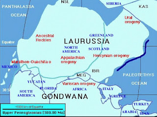
Planimetric maps are maps that that show only the horizontal positions of the representation. There is no topographic relief in planimetric maps, although features such as rivers, boundaries, and large bodies of water (as seen in this map) are represented. This particular planimetric map represents what a large part of the earth may have looked like 300 million years ago.
Subscribe to:
Posts (Atom)