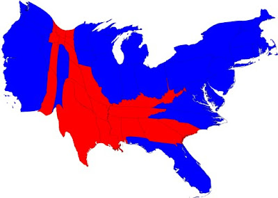
 Cartograms are maps that portray land size according to data, causing the map to look distorted compared to its actual dimensions. This map, for example, represents the 2008 election and redistributes the dimensions of each state based upon their population. Looking at a standard thematic map, it almost looks as if there are more red states than blue states, but compared to this cartogram, it becomes more apparent that a much larger total population voted democrat. This map is also planimetric and thematic, and could very well be used for propaganda purposes as well.
Friday, April 23, 2010
Cartograms
 Cartograms are maps that portray land size according to data, causing the map to look distorted compared to its actual dimensions. This map, for example, represents the 2008 election and redistributes the dimensions of each state based upon their population. Looking at a standard thematic map, it almost looks as if there are more red states than blue states, but compared to this cartogram, it becomes more apparent that a much larger total population voted democrat. This map is also planimetric and thematic, and could very well be used for propaganda purposes as well.
Subscribe to:
Post Comments (Atom)
No comments:
Post a Comment