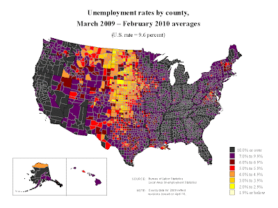
 Statistical maps contain data that are variable from area to area and can be measured from some kind of key. These maps can utilize color, dots (such as a dot distribution map), bars, isolines..etc. This map shows the change in unemployment rates from March, 2009-February, 2010. This map is also planimetric, thematic, and chloropleth.
http://images.google.com/imgres?imgurl=http://www.bls.gov/lau/maps/twmcort.gif&imgrefurl=http://www.freerepublic.com/focus/f-news/2332793/posts&usg=__l4nko4NwSo_6qlvlA2R6nshS9lU=&h=719&w=959&sz=48&hl=en&start=133&um=1&itbs=1&tbnid=jqEAvM0NXL0erM:&tbnh=111&tbnw=148&prev=/images%3Fq%3Dstatistical%2Bmaps%26start%3D126%26um%3D1%26hl%3Den%26sa%3DN%26gbv%3D2%26ndsp%3D18%26tbs%3Disch:1
No comments:
Post a Comment