Friday, April 23, 2010
Mental Map
Mental maps are maps that are congitively developed by each individual. Each individuals mental map will vary from person to person, for example, if two people were asked to draw a map of the same place.
Star Plots
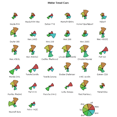
 Star plots are tools used to examine multiple data sets for one given object and compare them to one another. This star plot compares statistics of each vehicle such as HP, MPG...etc.
http://images.google.com/imgres?imgurl=http://addictedtor.free.fr/graphiques/graphiques/graph_63.png&imgrefurl=http://addictedtor.free.fr/graphiques/graphcode.php%3Fgraph%3D63&usg=__sxidhX3R70XXFqEqLTQ345RF9ms=&h=500&w=500&sz=10&hl=en&start=10&um=1&itbs=1&tbnid=pflixI2RUZIaPM:&tbnh=130&tbnw=130&prev=/images%3Fq%3Dstar%2Bplots%26um%3D1%26hl%3Den%26gbv%3D2%26tbs%3Disch:1
Correlation Matrix
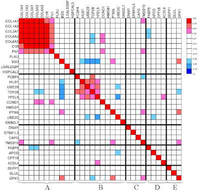
 A correlation matrix compares two different sets of data and the relationships between the two sets (correlation). Correlation matrices can determine whether two variables relate to each other very well or not at all. In this Matrix the correlation seems to be very strong between the variables.
http://images.google.com/imgres?imgurl=http://www.livestockgenomics.csiro.au/Genome_to_Phenome/matrix32_blocked.png&imgrefurl=http://www.livestockgenomics.csiro.au/Genome_to_Phenome/&usg=__Yfd_2_IeD8SayFb7gH7f48l9Nl4=&h=597&w=622&sz=82&hl=en&start=2&um=1&itbs=1&tbnid=5QQiOkveFfGYEM:&tbnh=131&tbnw=136&prev=/images%3Fq%3Dcorrelation%2Bmatrix%26um%3D1%26hl%3Den%26gbv%3D2%26tbs%3Disch:1
Similarity Matrix
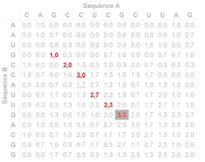
 A similarity matrix is a matrix (or box) of numbers which create a table that show a similarity between two sets of data. This example is a matrix used in gene sequencing.
http://www.google.com/imgres?imgurl=http://politicalmaps.org/wp-content/uploads/2008/05/electoral-map-prediction-05222008.gif&imgrefurl=http://meganblomberg.blogspot.com/2009_04_01_archive.html&usg=__k1YAIfvcyY7bUWgXPiwluaSn4Q0=&h=474&w=742&sz=32&hl=en&start=158&itbs=1&tbnid=uetzXqw3j6roKM:&tbnh=90&tbnw=141&prev=/images%3Fq%3Dplanimetric%2Bmap%26start%3D147%26hl%3Den%26sa%3DN%26gbv%3D2%26ndsp%3D21%26tbs%3Disch:1
Stem and Leaf Plot
Box Plot

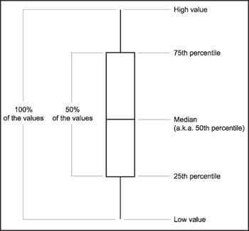
A box plot (or box and whiskers diagram) is a way of representing data through what is known as the 5 number summary. This includes the lowest value, lower quartile Q1, middle Q2, upper quartile Q3, and highest value as shown in this example. This example has no numerical data, but most box plots combine this with numerical data to specify where that data falls into the 5 number summary.
Histogram
Subscribe to:
Comments (Atom)

