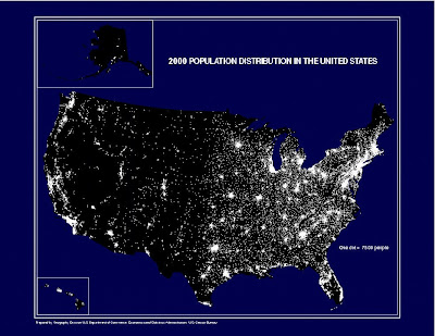
Dot distribution maps (also called dot density maps) use dots or other symbols to represent the occurrence of a particular data set in a given location. The map shown here is a very common dot distribution map by the U.S. Census Bureau for the population density of the U.S. in the year 2000, where one dot represents 7,500 individuals. This map can also be classified as planimetric and thematic.
No comments:
Post a Comment